Norton Motorcycle has spent the last few years restoring its reputation, but 2026 is looking like they year it will really take off under the wing of its owner, TVS Motor Company.

www.motorcycle.com
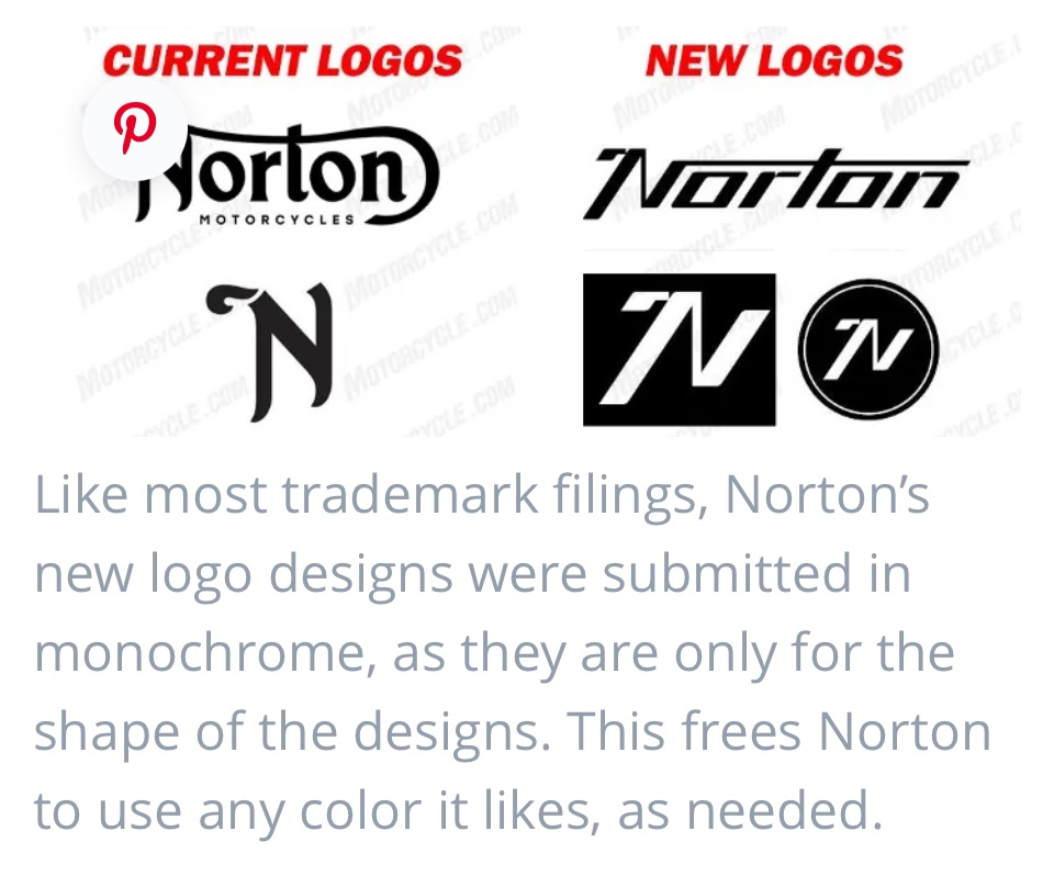
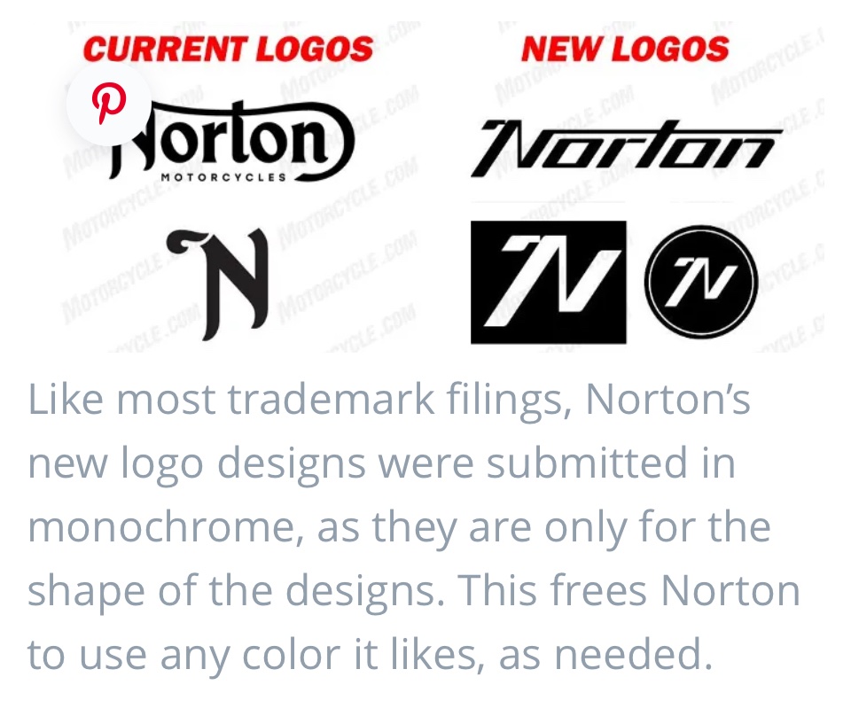
Spotted this one on FB on one of the groups posted by Allan, New Norton logos
Shame to see the old one go.
Having been in the print industry at the high end since I was a kid dealing with some of the worlds best brands I’ve had a lot of over exposure to some stuff by the best an it kinda feels a bit generic to me and far to modern,
Especially with allot of people my age all riding modern classics for that classic feel.
The circle version reminds me of a default template in a few bits of software for water marking,
I know it’s changed over the years even when Shelley bought Pa Norton out but this is a big departure would have been interesting if they had interviewed the designers over it,
I always liked the story of the original creation of the Norton logo,
I’m in my 30s but a bit of an outlier listening to Vinyl, an riding a 650ss an 1927 16h but still it kinda leaves me a bit cold,
Having said all that if that’s the direction the branding is going in itl be interesting to see the bikes maybe it’s a bit of an insight as to the style of what’s coming.
What’s everyone think fan of the new change?