
Thanks for visiting Access Norton
- Guest view limit reached
- Create a free account (more details)
- Already a member? Click here to login
You are using an out of date browser. It may not display this or other websites correctly.
You should upgrade or use an alternative browser.
You should upgrade or use an alternative browser.
Finished Project. Finally!!!
- Thread starter gatsby
- Start date
- Status
- Not open for further replies.
gatsby
VIP MEMBER
- Joined
- Feb 20, 2012
- Messages
- 259
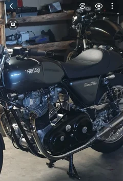
Well after I switched my belt drive back to a chain this morning (belt failed), I had time to look at the side cover. It appears that the metal behind the cover for the threads are two different lengths, and when tightened, it jacks the front of the cover higher. I added a rubber spacer under the rear bolt, and the decal aligned marginally better. I may be able to tweak it a bit more if I get a longer bolt.When I was about 50, I got into a discussion about the man in the moon. I mentioned that I didn't understand why it is depicted as a smiling face since I had always seen it as a king in a throne. After being laughed at for a while, someone outlined the face on a picture of the moon – then I saw what others saw.
In other words, it can be a matter of perception. The "Norton" aligns with the stripes. Generally, that's what I see when I look at your cover without the angle being pointed out, and I've seen originals that way, or with the lines more tilted, and of course with the "Norton" more level. Some say the "Norton" needs to be level on the center stand, some say level off the center stand, some say level when sitting on the bike, some say aligned with the "Z-Plate" – all are different, and none look right if your perspective is different. Going by brochures, it's wrong but the bikes were not built to brochure pictures! In fact, the lines were pinstriped and then sticker put on by humans - not very consistently - I really double that they used a level or even a template - too much variance. To me, there is no way to make it look "right" since there are too many angles in the area to catch your eye.
I would be interested in seeing a picture of the other side. When I look at your picture of the timing side, it appears to me that the cover itself is crooked. The bottom does not align with the "Z-Plate" and the right side does not appear to align with the frame tube. It may be that the spacers between the oil tank and cover are reversed, or the oil tank is not sitting properly. As KiwiShane said, you may be able to improve the look with spacers.
Thanks for the tip KiwiShine and Greg!!
EstuaryBoy
Basic
- Joined
- Mar 7, 2020
- Messages
- 3,143
Close enough for Rock'N'Roll!!!!Well after I switched my belt drive back to a chain this morning (belt failed), I had time to look at the side cover. It appears that the metal behind the cover for the threads are two different lengths, and when tightened, it jacks the front of the cover higher. I added a rubber spacer under the rear bolt, and the decal aligned marginally better. I may be able to tweak it a bit more if I get a longer bolt.
Thanks for the tip KiwiShine and Greg!!
View attachment 107932View attachment 107933
")
Dave Swanson
Basic
- Joined
- Jun 28, 2010
- Messages
- 64
The 850 Commando looks good to me.

gatsby
VIP MEMBER
- Joined
- Feb 20, 2012
- Messages
- 259
Nice!!!!The 850 Commando looks good to me.
grandpaul
VIP MEMBER
- Joined
- Jan 15, 2008
- Messages
- 14,078
I typically point that out, too.Beautiful bike and great metal flake colour. Love it!
My only critique would be the: "850
Commando" on the side pannels, which are not parralel to the z plate top. This is my only pet peeve....IMHO. Some may agree also, and I may be ridiculed. A common painter's mistake who is not familiar to a Norton Commando, unless they see it on the bike after it is painted. As I see it ....It's climbing a hill!
But carry on.
By the way....I forced my painter to redue mine on my Interstate the first time. It was climbing a hill. It cost me.
but now I'm happy.
BUT, I also mention - owner & painter need to have the reworked/prepped/primed parts, ON THE BIKE, and the bike set on it's centerstand, to properly get those angles correct, using a level and thin strip masking tape.
Thusly:
@gatsby as @marshg246 pointed out, "no two are alike", so don't worry too much. The bike is absolutely stunning. I'd venture it'll take home an award if entered in a bike show...
marshg246
VIP MEMBER
- Joined
- Jul 12, 2015
- Messages
- 6,077
The two spacers are normally different lengths. But notice the angle of the front one. I think that's because the top of the cover is bowed. I'm used to seeing the top of the cover being straight. It may be that if you straighten the top of the cover it will align better. Also, it may be that the oil tank is crooked. All that said, the cover does appear to be sitting better and it has improved the look and I would not fret over it! I would never have commented except someone else did about it being crooked. Looked OK to me before and better now. Especially on light colors the frame alignment is more important to me that than the angle of "Norton". With black covers you don't notice frame alignment, so the logo angle is more important.Well after I switched my belt drive back to a chain this morning (belt failed), I had time to look at the side cover. It appears that the metal behind the cover for the threads are two different lengths, and when tightened, it jacks the front of the cover higher. I added a rubber spacer under the rear bolt, and the decal aligned marginally better. I may be able to tweak it a bit more if I get a longer bolt.
Thanks for the tip KiwiShine and Greg!!
View attachment 107932
CanukNortonNut
Basic
- Joined
- Aug 8, 2005
- Messages
- 2,986
That looks better.Well after I switched my belt drive back to a chain this morning (belt failed), I had time to look at the side cover. It appears that the metal behind the cover for the threads are two different lengths, and when tightened, it jacks the front of the cover higher. I added a rubber spacer under the rear bolt, and the decal aligned marginally better. I may be able to tweak it a bit more if I get a longer bolt.
Thanks for the tip KiwiShine and Greg!!
View attachment 107932View attachment 107933

KiwiShane
Basic
- Joined
- Mar 22, 2021
- Messages
- 2,371
You nailed it mate...bling blingWell after I switched my belt drive back to a chain this morning (belt failed), I had time to look at the side cover. It appears that the metal behind the cover for the threads are two different lengths, and when tightened, it jacks the front of the cover higher. I added a rubber spacer under the rear bolt, and the decal aligned marginally better. I may be able to tweak it a bit more if I get a longer bolt.
Thanks for the tip KiwiShine and Greg!!
View attachment 107932View attachment 107933

B+Bogus
Basic
- Joined
- Jun 28, 2009
- Messages
- 2,365
Nice bike
On the subject of sidepanel graphics, this is an unrestored original bike from a French website
Prior to 850s with pinstriped panels, the graphic followed a horizontal line parallel to the Z plate, but it isn't the case for pinstriped panels - I've yet to see an original one where the graphic did not run parallel to the pinstripe - the factory brochures are all consistent on this
this is my take on the subject:
Finally, examples of both styles together
KiwiShane
Basic
- Joined
- Mar 22, 2021
- Messages
- 2,371
I do my own transfers and paint and far from original...but I think getting the leading face of the side covers to run nice and parallel to the angled frame tube before setting up for pinstripes /transfers is the best way to get everything symmetrical before taping them out to spray ...with them fitted on the bike....That metal flake paint job you have had done gatsby looks sharp
Attachments
marshg246
VIP MEMBER
- Joined
- Jul 12, 2015
- Messages
- 6,077
Nice bike
On the subject of sidepanel graphics, this is an unrestored original bike from a French website
Prior to 850s with pinstriped panels, the graphic followed a horizontal line parallel to the Z plate, but it isn't the case for pinstriped panels - I've yet to see an original one where the graphic did not run parallel to the pinstripe - the factory brochures are all consistent on this
this is my take on the subject:
Finally, examples of both styles together
Agreed! My guess has been that Norton saw the problem and found a solution. By adding the lines on 850s and aligning the logo with the lines made the logo not look mis-aligned. Like I said before, it's a matter of your perspective or focus. Yes, I realize that the lines correspond to the tank lines but you can look at Norton competitors from the day and see examples of tank lines with none on the side panels on some iconic bikes.
Also, if you look at both the 73 and 74 brochures, you'll see the other thing I said before - no consistency. Humans painted the lines, by eye - probably taking a few seconds each. The logo sticker was applied separately. From the 73 brochure - lines (not gold) running along the edge and the logo lower than usually seen on 850s, in gold:
From the 850 brochure. The lines not as near the edge, angled upward and the logo much closer to the lines but not well aligned with the lines:
ashman
VIP MEMBER
- Joined
- Jul 11, 2010
- Messages
- 6,876
Who's going to notice minor things like what been said when you are out and about going past everyone and enjoying your creation, to me it looks great no matter what everyone thinks or how it sits, when riding no one will know and it's great to see a different colour to the normal and not every bike that comes off the production line is going to be the same, now get out there and ride it, get some road grime on it as its meant to be ridden no matter what and enjoy it.
gatsby
VIP MEMBER
- Joined
- Feb 20, 2012
- Messages
- 259
Road grime application started! Thanks for the kind words ashman.Who's going to notice minor things like what been said when you are out and about going past everyone and enjoying your creation, to me it looks great no matter what everyone thinks or how it sits, when riding no one will know and it's great to see a different colour to the normal and not every bike that comes off the production line is going to be the same, now get out there and ride it, get some road grime on it as its meant to be ridden no matter what and enjoy it.
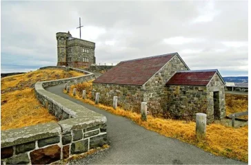
Beautiful night at the most Easterly point in North America (Signal Hill, St. John’s Newfoundland). My 850 decal being off a few degrees certainly did not have an affect on my ride
KiwiShane
Basic
- Joined
- Mar 22, 2021
- Messages
- 2,371
Man ...I just checked out the history of your location/destination ride...beautiful scenery and such a amazing place...enjoy Bro.Road grime application started! Thanks for the kind words ashman.
Beautiful night at the most Easterly point in North America (Signal Hill, St. John’s Newfoundland). My 850 decal being off a few degrees certainly did not have an affect on my ride
Attachments
gatsby
VIP MEMBER
- Joined
- Feb 20, 2012
- Messages
- 259
it is very beautiful and scenic here. Short riding season, but wonderful when the weather cooperates!Man ...I just checked out the history of your location/destination ride...beautiful scenery and such an amazing place...enjoy Bro.
KiwiShane
Basic
- Joined
- Mar 22, 2021
- Messages
- 2,371
You guys have a very distinct accent up your way..I'd be right at home up there ..as it sounds like a really cool/good/friendly place to live ...I also love my fishing and those Atlantic blue fin tuna...are very tasty and a thrill to catch....Godzone Bro.it is very beautiful and scenic here. Short riding season, but wonderful when the weather cooperates!
- Status
- Not open for further replies.